- Client | Flixbus
- Role | UX/UI Designer, UX Researcher
- Year | 2024
Overview
Self-initiated project adding a new feature to improve the Flixbus user experience for overnight trips with transfers.
Background
Flixbus is a golbal transportation company specialising in bus and train services, with a strong presence in Europe.
Problem
Flixbus includes overnight transfers where passengers may need to wait at outdoor bus stops, which can be uncomfortable (in terms of security and personal comfort).
Goal
Introduce new features for night transfer users without indoor bus stations.
My Impact
This project includes a feature for booking a nearby overnight waiting place for your transfer from the bus station.

I chose to work on this Project Because
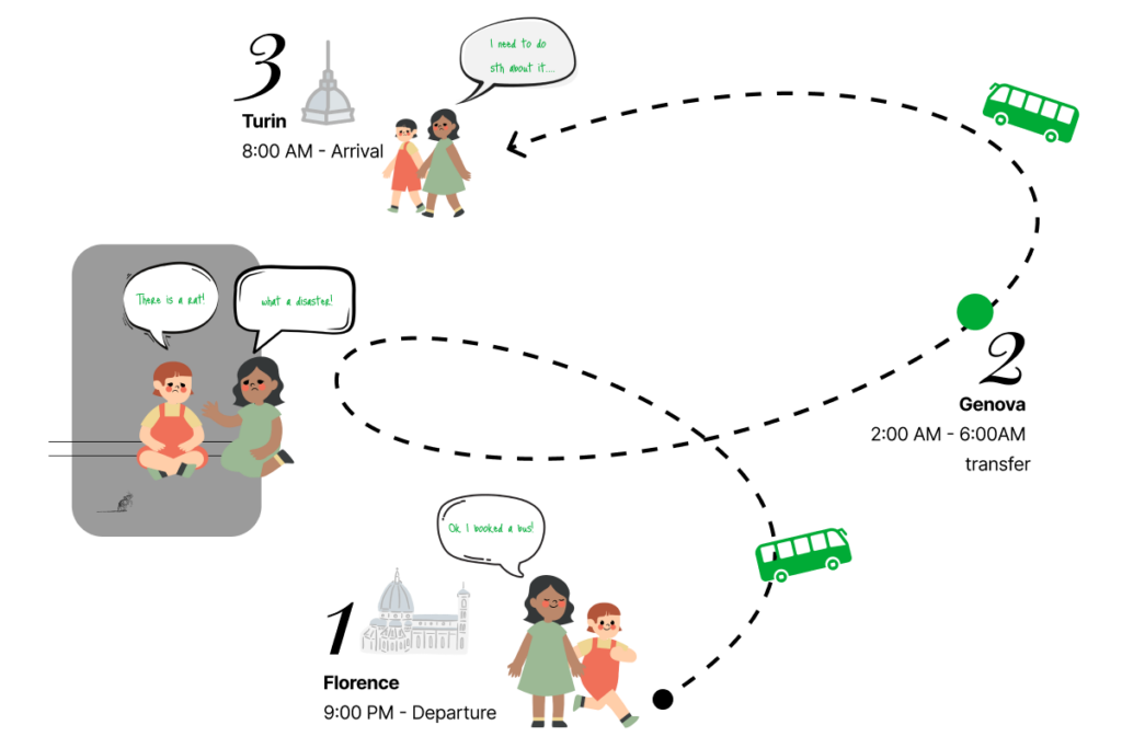
On a spring day in 2023, my friend Tatiana and I had to travel from Florence to Turin by FlixBus due to a train cancellation.
Everything went smoothly in booking, but we had a 5-hour overnight wait for the next bus outside in Genova!
Challenge
Exploring effective strategies to provide temporary shelter at bus stops that do not have adequate station facilities for prolonged overnight transfers. This includes considering options for safe and comfortable accommodations during extended waiting periods.
Approach
The introduction of the latest feature allowing users to book spaces for overnight stays lasting more than one hour offers a convenient solution for prolonged and transfers, enhancing the overall user experience.

What changes the story?
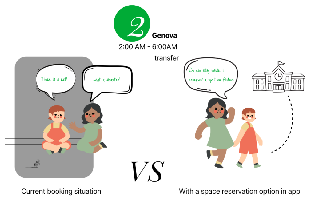
In this intervention, a temporary shelter can be booked through the FLIXBUS app when booking a night trip with a transfer.
The available places for booking include public places such as schools, universities, and nearby libraries, as well as any other private or public space that can provide shelter with minimal interference to their security systems and be autonomous.
Current VS Updated User-flow
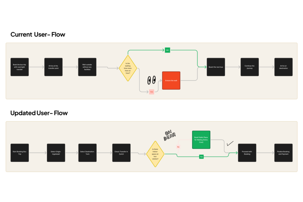
In the current user flow, if you have a trip with a transfer, you often have to wait outside without access to facilities, leading to discomfort and dissatisfaction.
The updated user flow addresses this issue by providing users with a safe, short stay where needed. This option does not require any new infrastructure and is sustainable, as it makes use of locations that might otherwise be unused during the night. It also increases passenger satisfaction by demonstrating that FlixBus takes responsibility for the entire duration of the trip, not just the time spent on the bus. This approach fosters customer loyalty and trust.
Early sketches and Iterations
Given that this project is built upon an existing application, I conducted a thorough analysis of the current user flow. I identified the necessary interventions required for the implementation of this new feature across all pages. This phase involves simultaneous integration and modification processes.
UI improvements
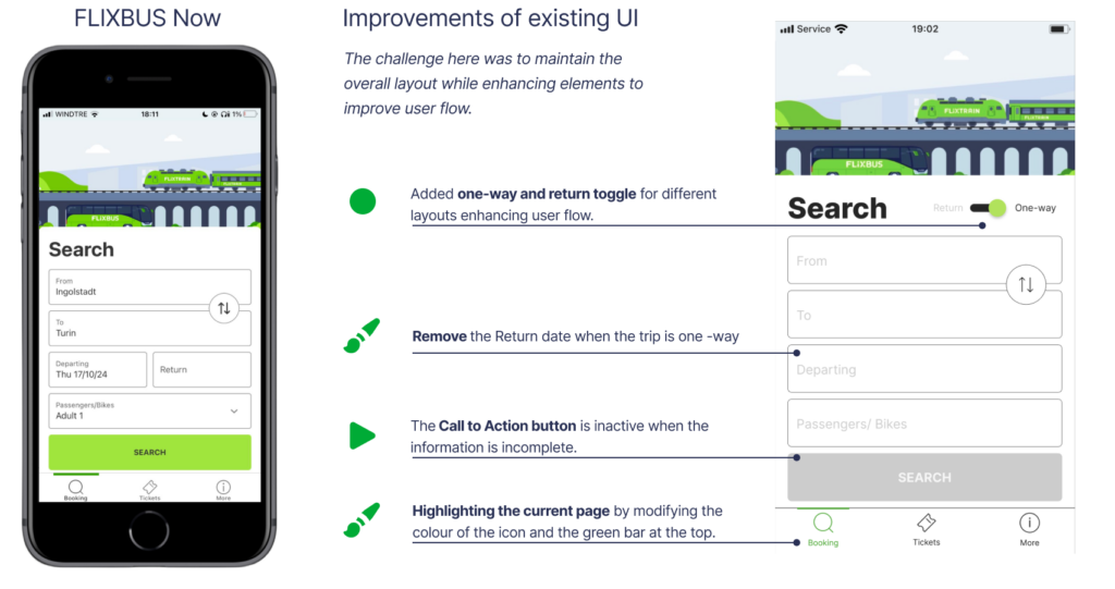
While studying and applying the new features, I realized that there are also necessary modifications in User Interface design that could significantly enhance users’ interaction with the application. Therefore, I made an effort to map out these features while sketching and wireframing.
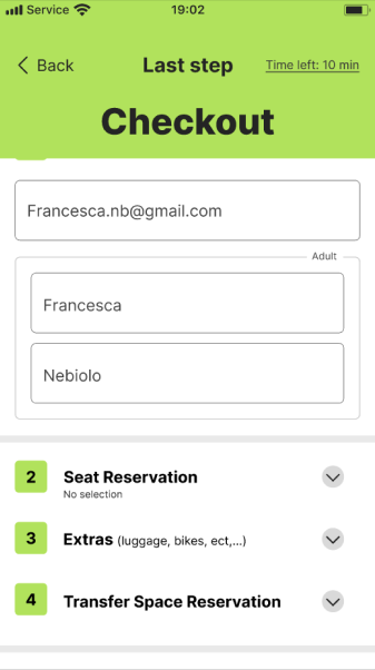
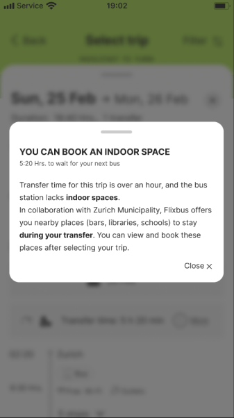
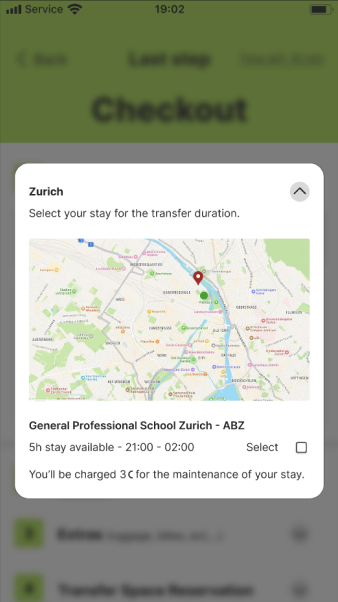
Book a short stay for overnight transfers!
Users can find nearby safe areas around bus stops to rest while waiting for the bus.
- Public infrastructures 5-10 mins from bus stops.
- Provide seating, indoor lighting, no interference with building security.
User Testing
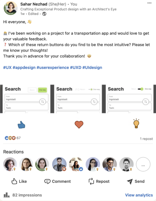
During the process outlined in this brief post, I was able to carefully evaluate various options I had designed for a toggle based on the feedback I received.
Interview
This project has been thoroughly tested by individuals residing in Europe who actively engage with FlixBus services on a regular basis. Their feedback has been instrumental in shaping the outcome.
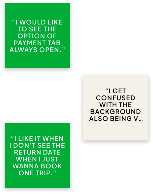
And?
Transfer Space Reservation
What I have learnt
What next?
This feature has been added to the specific user flow in the Flixbus booking process. It addresses a common pain point where passengers have to wait outside for the next bus, especially during night transfers lasting over an hour.
By prioritising this aspect, Flixbus demonstrates its commitment to enhancing the quality of the travel experience, building trust with customers, and reducing their anxiety when embarking on such journeys.
During my design process, I discovered the value of gathering continuous feedback through simple interviews, which ultimately results in a more streamlined design.
The potential for improvement is endless, and users can offer valuable insights and fresh ideas! Nevertheless, it’s beneficial to carefully consider and evaluate changes before completely revamping the design.
The next steps involve conducting a comprehensive user testing analysis for overnight trips to understand passenger preferences when considering staying indoors during their transfer time.
Additionally, enhancing iconography for clearer communication
refining motion design for better user experience
and making subtle adjustments to the color palette to improve accessibility without compromising the brand identity are recommended.
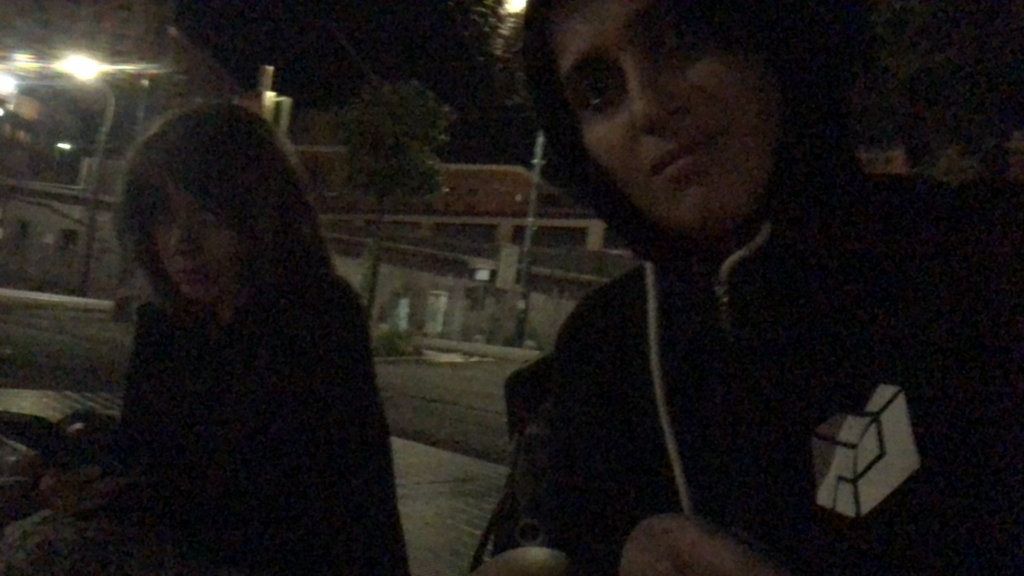
22 June 2023 – 03:12 AM – Genova
Tatiana and I are waiting for our next bus & where I decided to become a UX Designer!
