Role & Services
In collaboration with Isolarchitetti, the responsible sector for this project, I contributed to the graphic design concept, packaging strategy, and the stand graphic design palette.
Year
2021
This project involves designing the identity package for a new museum located in the former Chiesa di San Francesco and the Ex Ospedale Militare.

About
The Chiesa di San Francesco, also known as the Ex Ospedale Militare, is a historically significant building in Alessandria, Piemonte, Italy. This complex has a rich and varied history spanning several centuries.
Originally constructed between 1254 and 1290 by the Franciscan order, the church was part of a larger conventual complex that became one of the principal religious sites in medieval Alessandria.
The structure is a fine example of Italian Gothic architecture, reflecting an evolution from Lombard Romanesque style, particularly notable in its extensive use of brick. Over the centuries, the building has served various purposes:
- Church and convent (13th–18th centuries)
- Cavalry barracks (early 19th century)
- Military hospital (1833–1989)
Significant modifications were made to the structure over time, including the division of the church into two floors in 1816.

Architectural Concept
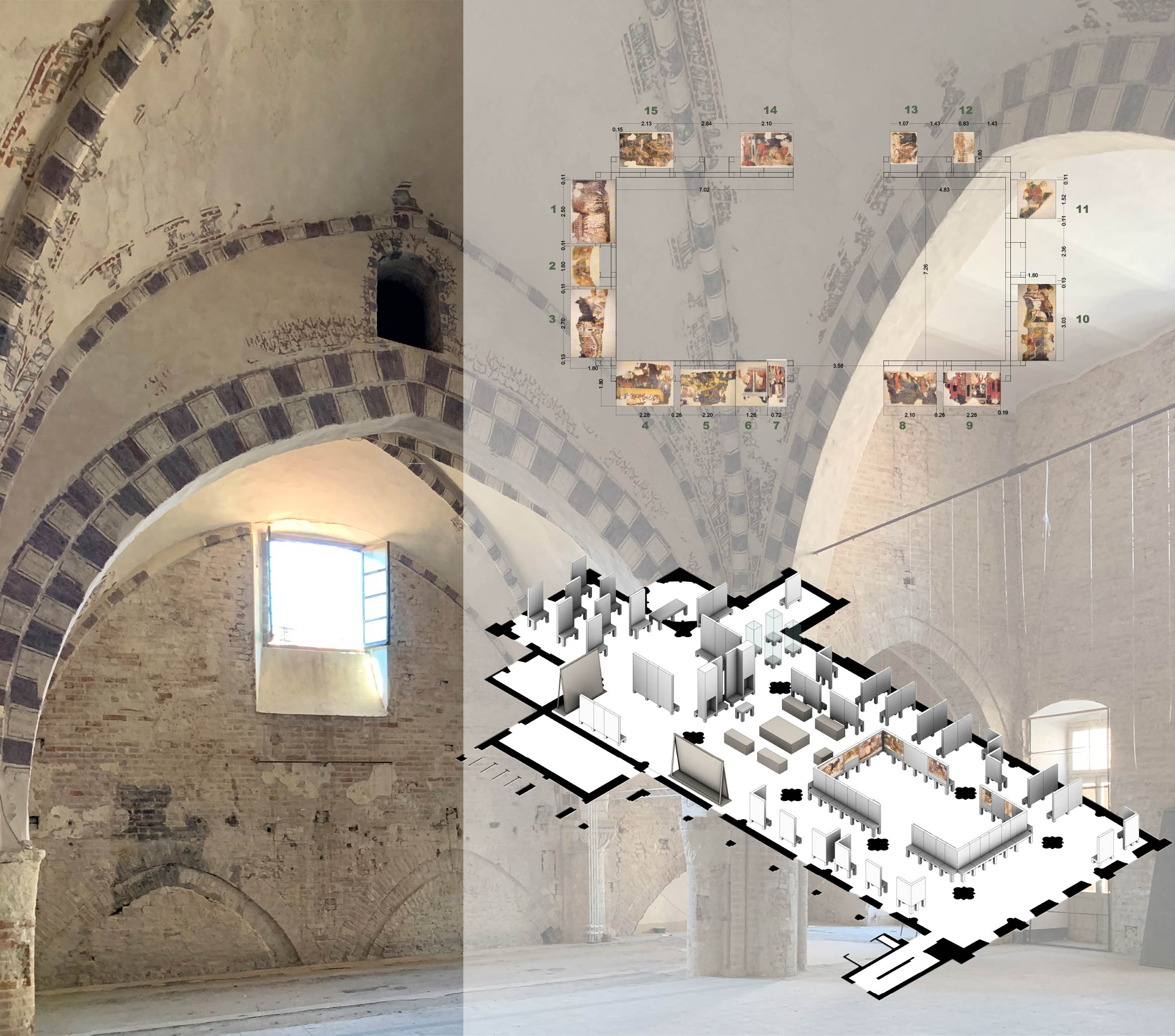
The architectural design focuses on preserving and honoring the building’s layered history while adapting it for its new role as a museum.
My Role in the Identity Package Design
Identity Design
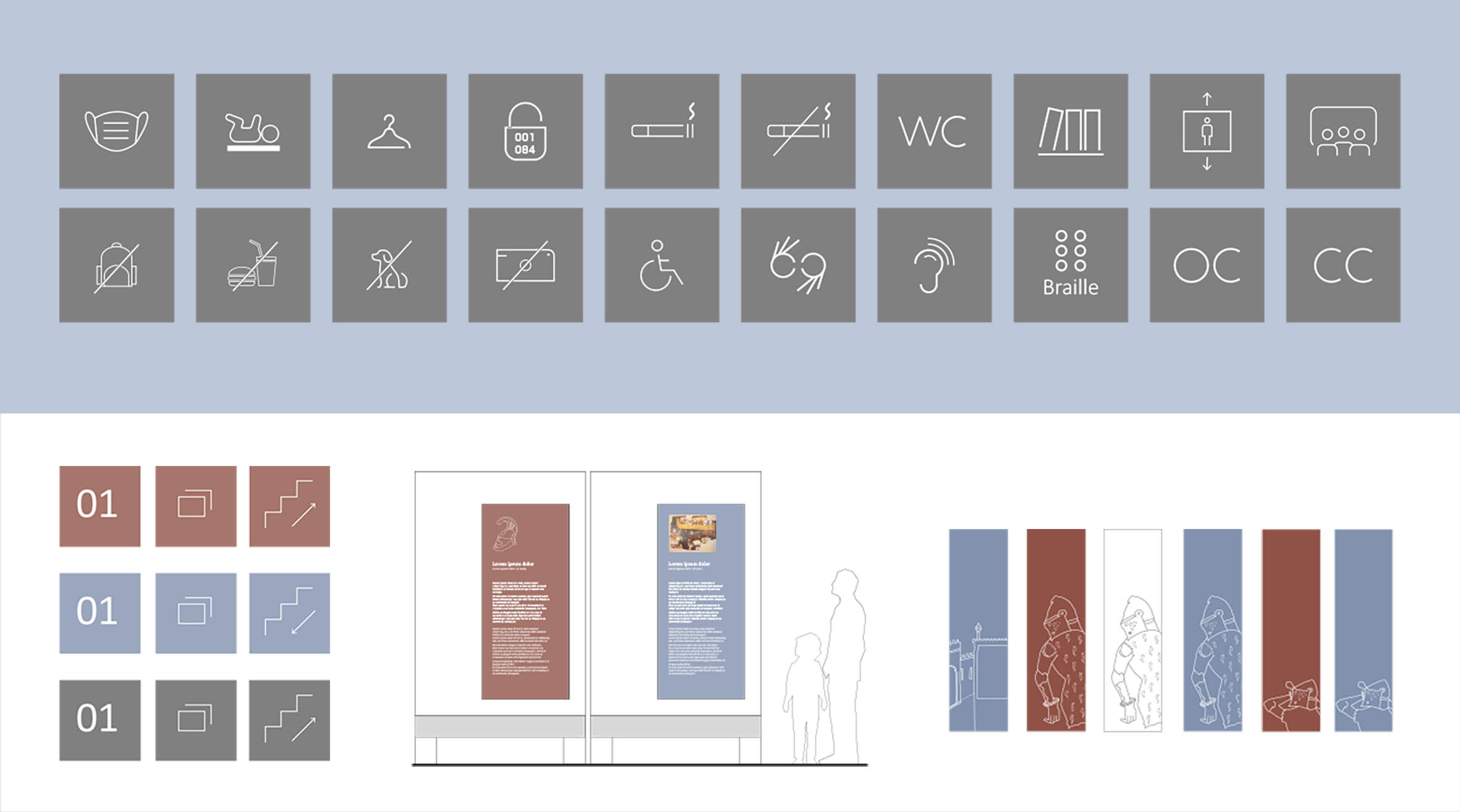
For this project, I drew inspiration from the motifs and narratives of the antique paintings that will be exhibited in the new museum. These paintings reflect the history of Alessandria, and this historical context deeply influenced my approach.
The color palette was developed based on the original decorations and colors uncovered during restoration, as the white plaster was removed. This palette captures the authentic tones of the site’s history.
Accessibility and Signage Design
Accessibility was a key focus in the signage design. Integrating a museum into a building not originally intended for such use requires careful attention to readability and navigation.
- Signage and Stands:
Each stand is color-coded to represent a distinct historical period, enhancing the visitor experience. - Labels:
Labels were designed following museum standards, ensuring clarity and legibility.
The goal was to create a design that balances historical reverence with functional modernity, ensuring an inclusive and immersive experience for all visitors.


